Use Analytics Dashboards
The Analytics module displays interactive charts of scheduling data. Use these dashboards to visualize trends, monitor performance, and identify key insights.
This article explains how to navigate dashboards, apply filters, and explore data.
Navigate Between Dashboards
Use the Dashboard dropdown menu to switch between dashboards. Each dashboard displays different types of data.
Note: Dashboards are listed alphabetically, and dashboard titles cannot be modified.
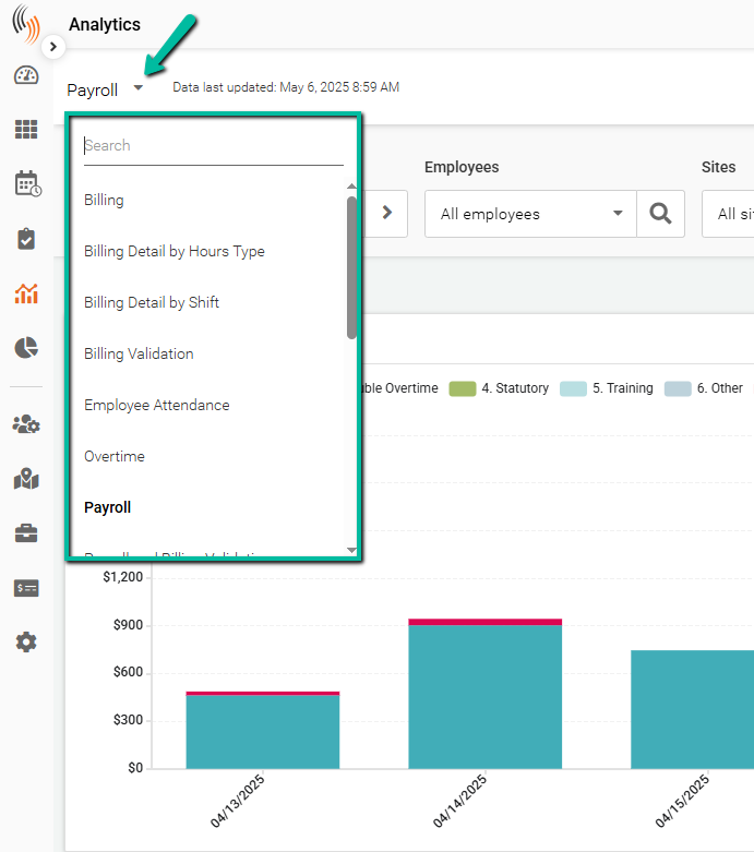
Once you select the dashboard you want to use, the data will be displayed.
The Analytics module displays interactive charts of scheduling data, helping you visualize trends and optimize scheduling efficiency.

Select a Date Range
Select a date range to capture the data you want to review.
Available options include:
- Yesterday
- Today
- Previous Week
- Current Week
- Previous Month
- Current Month
- Previous Quarter
- Current Quarter
- Custom Range – Select your own start and end dates.
Selecting a date range is essential to ensure the data displayed matches the period you want to review.

Apply Employee and Site Filters
Use the Employee and Site filters to view data for specific employees or locations.
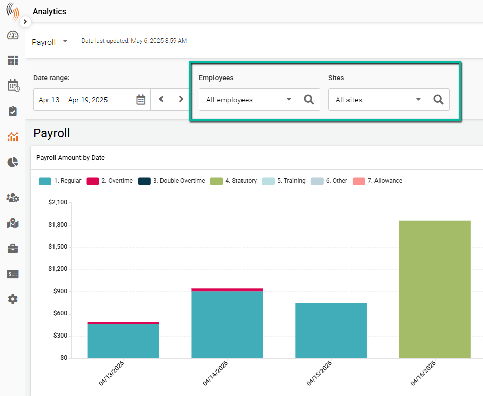
After making your selections, click Apply to activate the filters.
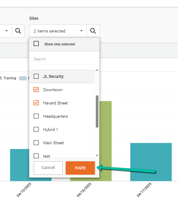
To clear your selections, click Reset All Filters under the employee or site filters.
Note: Clicking Reset All Filters clears all selections for the corresponding filter.

Interact with Data
Hover over any data point on a chart to view additional details.
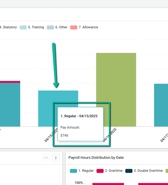
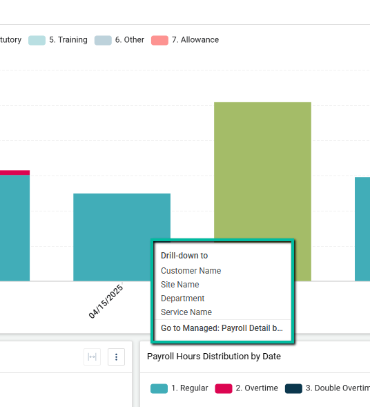
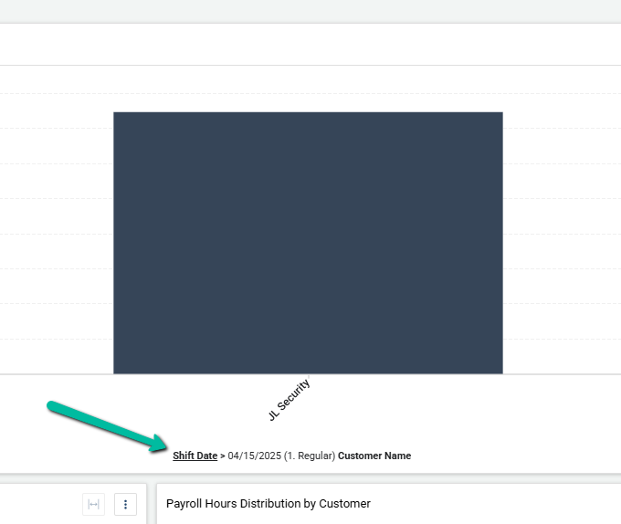
Click a data point, such as a bar in a chart, to drill down into more detailed information. Depending on the dashboard, this may include:
- Customer Name
- Site Name
- Department
- Service Name
In some cases, you may also have the option to view a more detailed version of the report.
For example, if you drill down to Customer Name, a new chart displays the related customers.
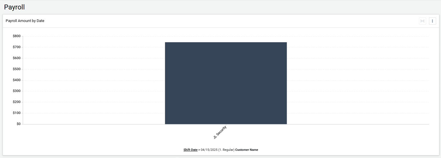
To return to the full data set, click the top-level category, such as Shift Date.
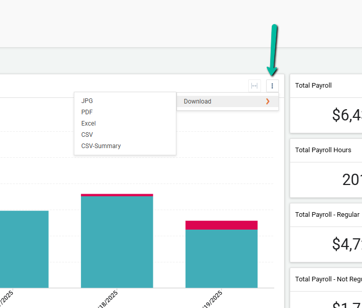
Export Reports from Analytics
Click the Three Dots Menu in the top-right corner of any chart to download a report.
Available export formats include:
- JPG
- Excel
- CSV
- CSV-Summary