Manage Time Processing Layouts
Time Processing layouts control how employee time data, including check-ins, check-outs, and totals, is displayed. By customizing layouts, you can tailor the view to support payroll processing, billing, and time review.
Access Layout Manager
To access the Layout Manager from Time Processing:
- Click the settings (gear) icon next to the layout name
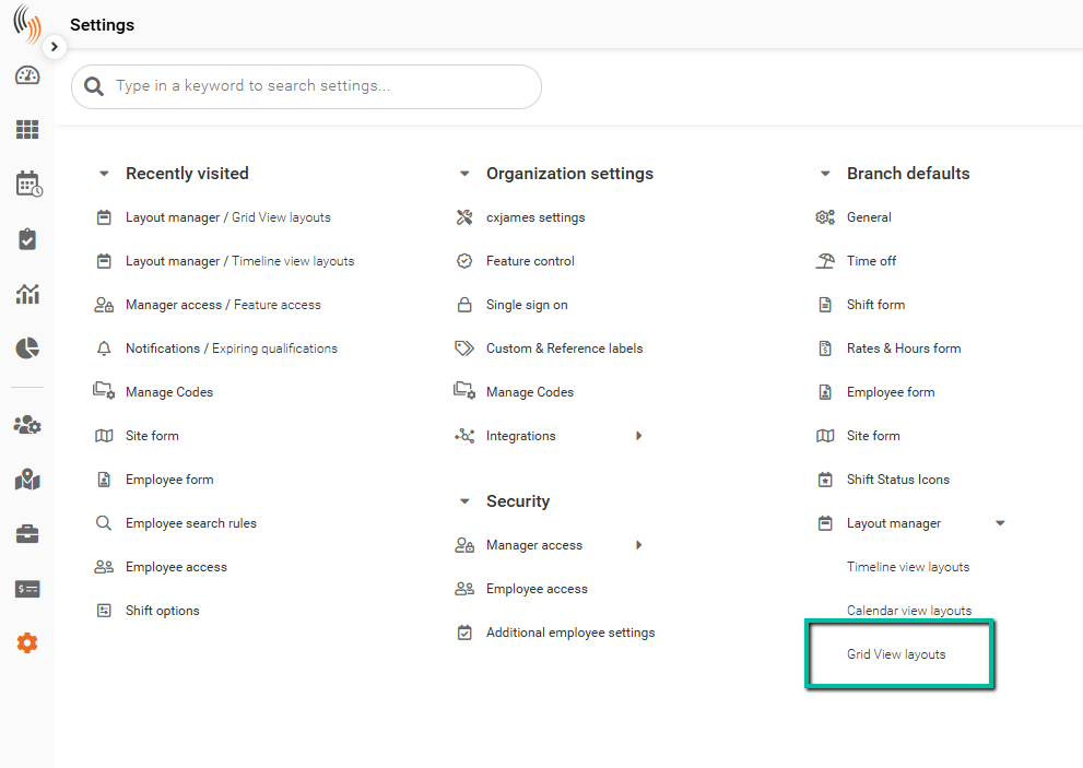
Alternatively, navigate to:
Settings → Branch Defaults → Layout Manager → Grid View Layouts
Layout Types
The following layout type is available for Time Processing:
Grid View – Displays time data in a structured table format
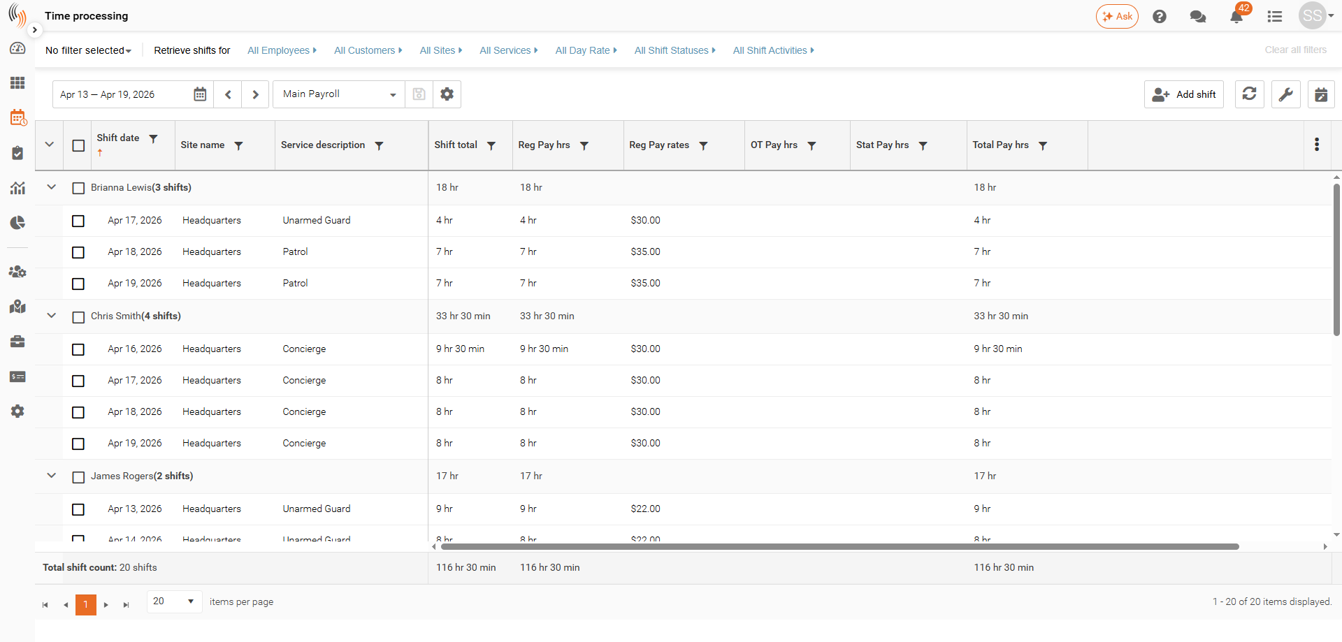
Grid View
The Grid View is designed specifically for Time Processing, providing a clear view of employee check-ins, check-outs, and totals.
This view is ideal for reviewing worked time and supporting payroll and billing processes.
Create Layouts
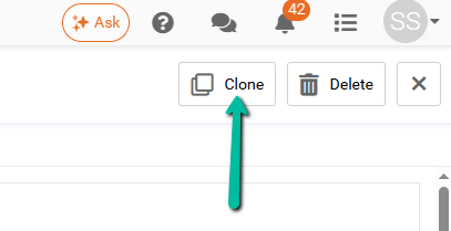
System layouts (marked with *) are read-only and cannot be modified.
To create a new layout, you must clone an existing system layout. Cloning creates a copy that you can then customize.
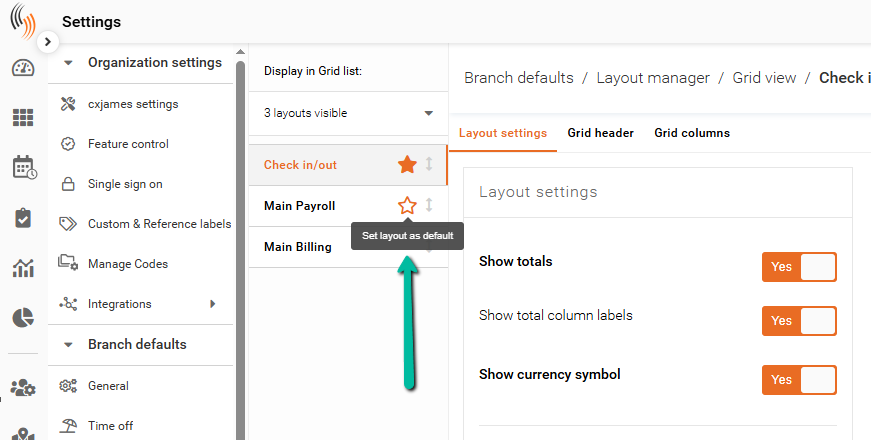
Set a Default Layout
You can set a layout as the default to ensure it loads automatically in Time Processing.
- Click the star icon next to the layout name
Configure Layout Display
The following sections define how time data is displayed in the grid.
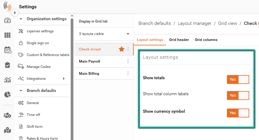
Layout Settings
These settings control general display behavior, including:
- Showing totals and column labels
- Displaying currency symbols
- Formatting date, time, and duration values
Important: The Celayix Support Team can modify the date, time, duration, and rate formats on any layout filters at your request, even thought this option is not visible to you. Please contact us if you need this assistance.
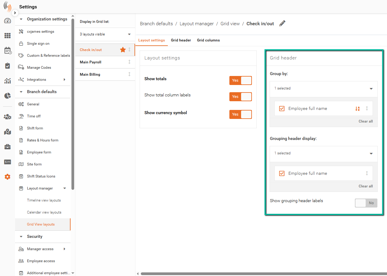
Grid Header
Defines how data is grouped across the grid.
- Group By – Determines how records are grouped (e.g., by Employee)
- Grouping Header Display – Controls how grouping labels appear
- Show Grouping Header Labels – Toggles label visibility
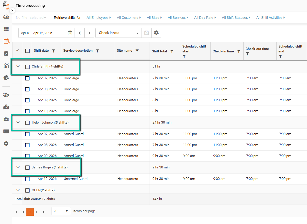
Here’s what this looks like in the grid when grouped by a field such as Employee Full Name.
The grid headers can be collapsed or expanded as needed.
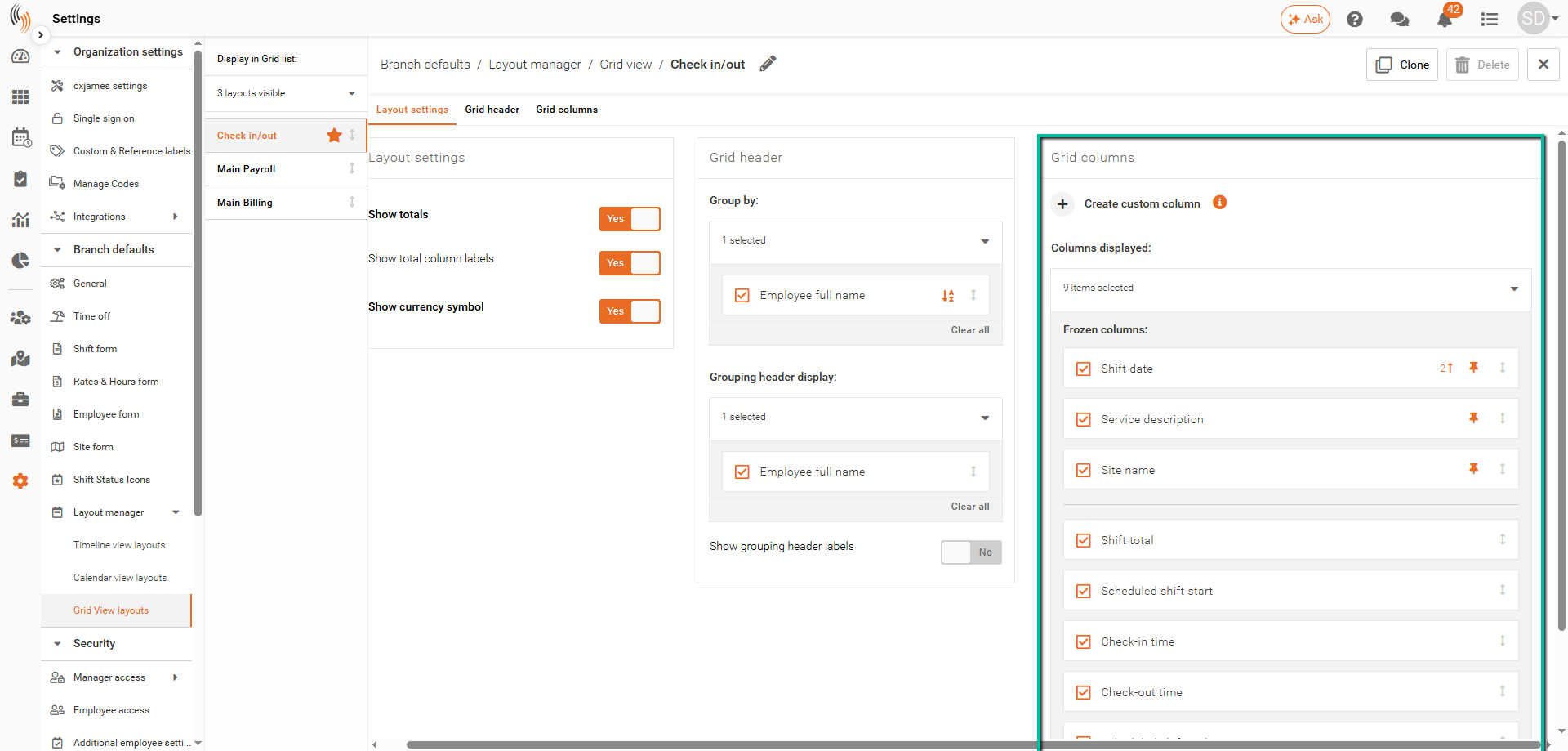
Grid Columns
These settings define which data fields are shown in the grid and how they are arranged.
- Select Columns – Use the dropdown under Columns displayed to choose which fields to include (e.g., Shift Date, Site, Pay Hours)
- Frozen Columns – Click the pin icon on the right side of each column block to keep it fixed while scrolling horizontally
- Reorder Columns – Use the arrows on the right side of each column block to change the order they appear in the grid
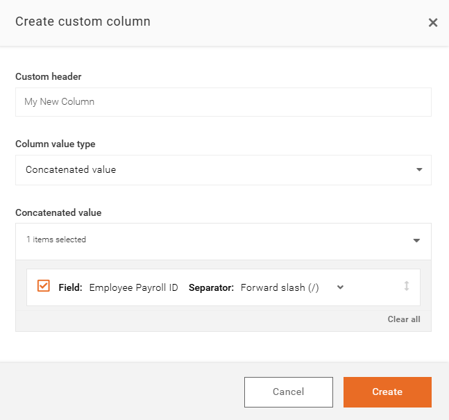
Create Custom Columns
These options are helpful if you need to customize an additional column in the grid to display extra information, static labels, or combined field values in a way that better matches your reporting needs.
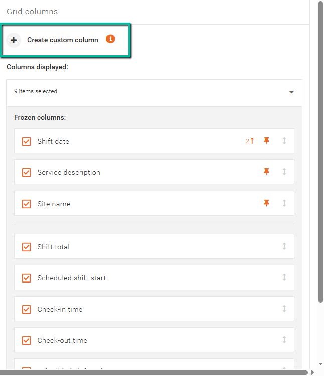
Here is a step-by-step guide for creating a custom column:
- Click Create custom column to add a new column to the grid.
- Enter a Custom Header to name the column, then choose a Column Value Type.
- Select the type of value you want the column to display:
- Fixed text value/blank lets you display a static value in the column or leave the column empty.
- Concatenated value lets you combine data from multiple fields into a single column for more flexible display options.
With Concatenated value, you can combine fields such as:
- Company
- Branch
- Customer
- Site
- Service
- Employee
- Shift References
- Pay Hours
- Rate columns
Choose a separator value to control how multiple fields are divided when combined into a single column, ensuring the information is displayed in a clear and readable format.
Click Create to complete the process, then position the new column correctly.